Reports
Reports is the view in Cavai Cloud for planning, optimizing, and reporting campaigns with Cavai creatives.

NOTE - While you are in Campaigns, Creative Groups, or Creatives view, you can open Reports view with data selected for a campaign, creative group, or creative by clicking the corresponding Impressions, Interacted, or Started column value. This will automatically generate and view a report to show the clicked metric data.
Features
- Easily create publication-ready data visualization
- Advanced statistical features in a dead-simple interface
- Instantly access reporting data through an API
Selecting data sources
Start analyzing your campaign and creative data by clicking the three-dot icon or the Add data source text next to it.
After clicking, you will see the data source selection view.
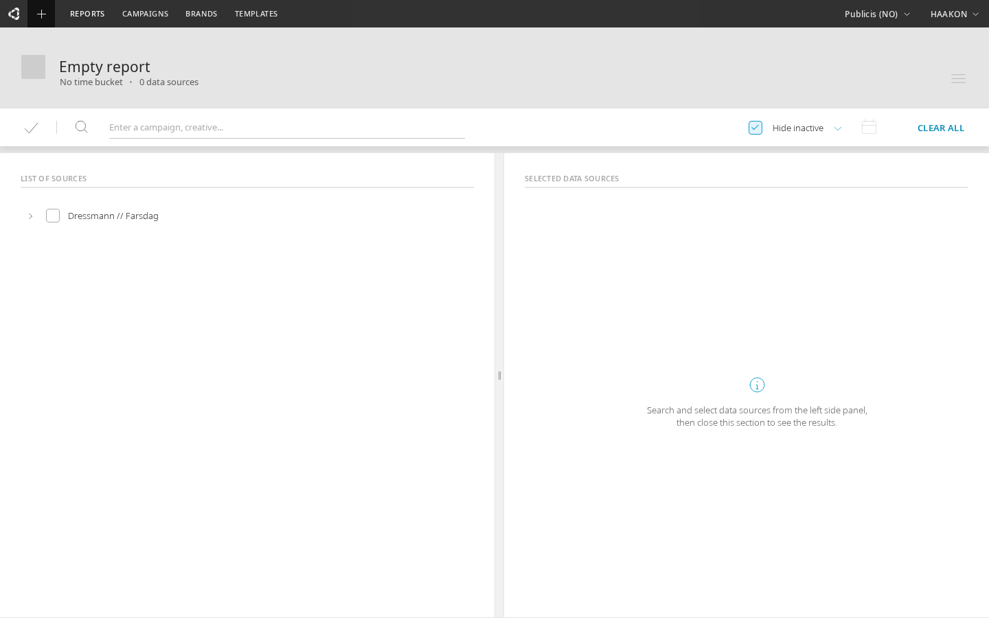
Data source selection view
On data source selection view (pictured below), campaigns, creative groups, and creatives can be searched by typing text on the search row that has a magnifying glass icon  in front of it.

On the data source selection view, the left pane with the title "LIST OF SOURCES" shows all available campaigns, creative groups, and creatives. These are shown in a hierarchical structure so that it is easy to see what creative groups are within which campaigns, and which creatives are within which creative groups.
In front of each row is a checkbox for selecting the data source in question. After clicking it, the data source will be shown on the right-side pane that has the title "SELECTED DATA SOURCES". If you want to unselect a data source, click the  icon after its name on the right-side pane, or unselect the checkbox on the left-side pane.
Bulk selection
The data source selection view includes a Select All dropdown for quickly selecting multiple items at once. Click the dropdown arrow next to the select-all area to choose what to select:
- All Creatives — selects all creatives in the tree
- All Creative Groups — selects all creative groups
- All Campaigns — selects all campaigns
- Invert Selection — toggles the selection state of all items (selected become unselected and vice versa)
A count badge shows the number of currently selected data sources. You can also use Option+click (Alt+click) on a parent node to toggle all its descendants.
The selection of the data sources can be a combination of any number of campaigns, creative groups, and creatives. For example, it is possible to compare creatives from two different campaigns, and it is also possible to compare a campaign, with a creative that is part of it or is from another campaign. Cavai Cloud does not set any limitations in this respect and makes it straightforward to visualize, compare, and analyze such datasets.
Filtering selection by "Hide inactive"
When the checkbox "Hide inactive" is selected, the viewed data sources are filtered to those that have been active at the given date range. The default date range is "Last 30 days", which can be changed by clicking open the date range selection dialog.

You can select the data range of "Last 7 days", "Last 30 days", "Last 90 days", or "Custom". If you select "Custom", the  icon becomes clickable. Clicking it open you will see date range selection menu and be able to set start and end date in the calendar-view.
After you are ready to proceed with the selected data sources, click the ready icon  on left side of the screen.
Metrics selection
Depending on the graph type, there may be the ability to select data for both the x- and y-axis of the graph. The y-axis data selection is always available. For example, in the line graph there is the possibility to select data on the y-axis, but not on the x-axis.
- Impressions
- Interacted
- Clickthroughs
- Started conversation
- Continued conversation
- Finished conversation
- Time goal met
- Reached goal
- Actions
Displaying data
There are two different tabs to examine a specific report, "Overview" tab and "Report" tab. You can select between them from the bottom left corner of the screen.

Overview tab
The Overview tab is styled for presenting the most wanted metrics in one clear view.
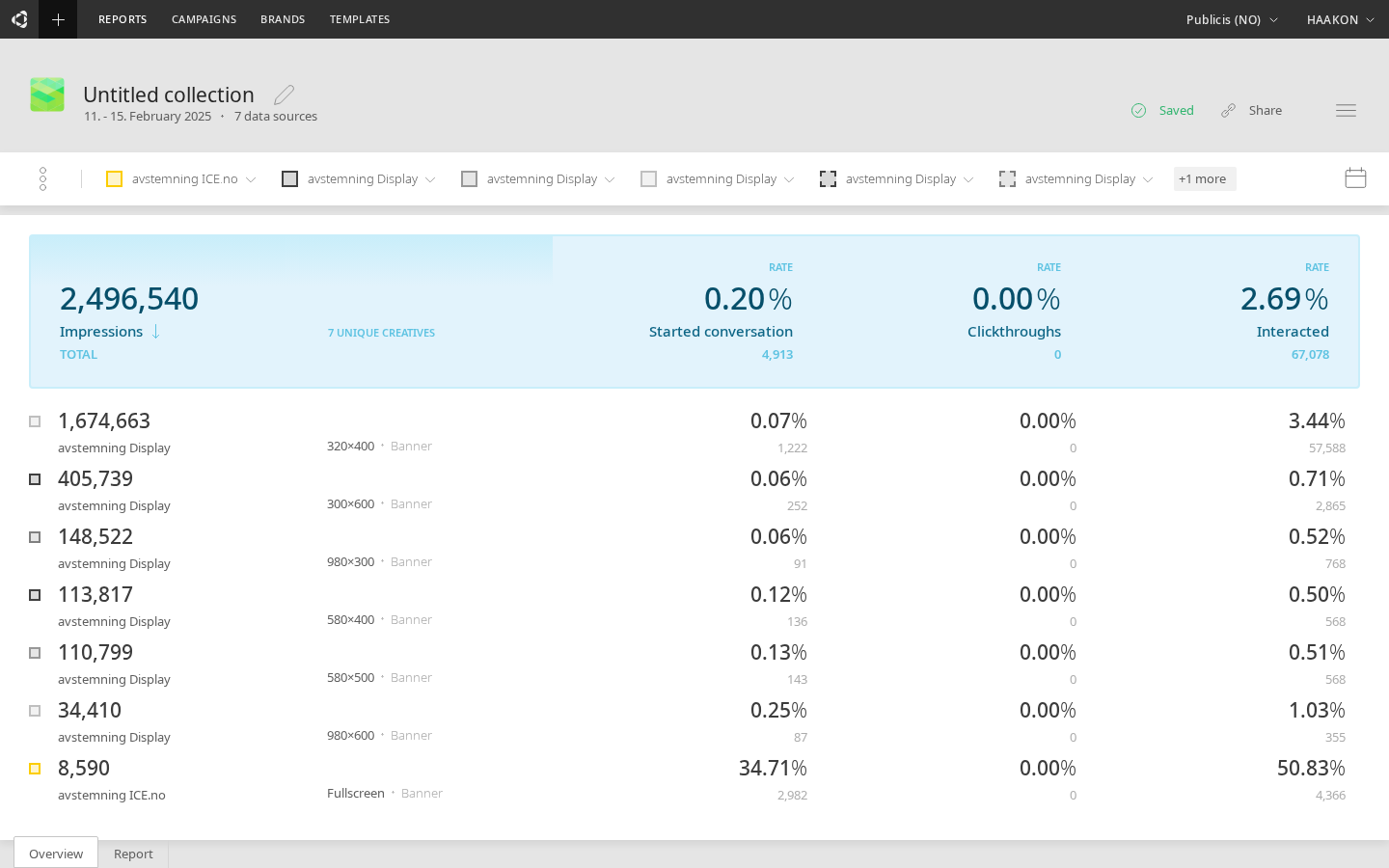
A unique property of the Overview tab is that the total count for each metric is calculated in a way where possibly nested rows do not cause duplications in values. This is different to table views, in which for example using a creative row and its creative group on separate rows show the sum over all the rows presented (even if this causes the same data to be calculated to the sum multiple times).
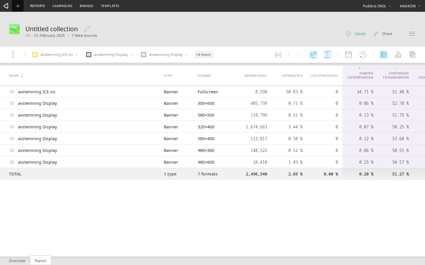
Report tab
Upon selection of the data source, the default line graph will be displayed. On the right side of the Report tab, a row of icons is presented.
 open up a dialog for defining a custom metric for the data
 toggles percentile change values of the data (e.g. change from the previous day)
 toggles rate values of the data (e.g. started rate)
 toggles aggregation of the data (e.g. 30 daily values into a single value)
- opens the date range selection menu (set start and end date in the calendar)
 opens the selection menu for time buckets (e.g. show daily data)
 toggles a table view of the data
 opens the menu for different chart types
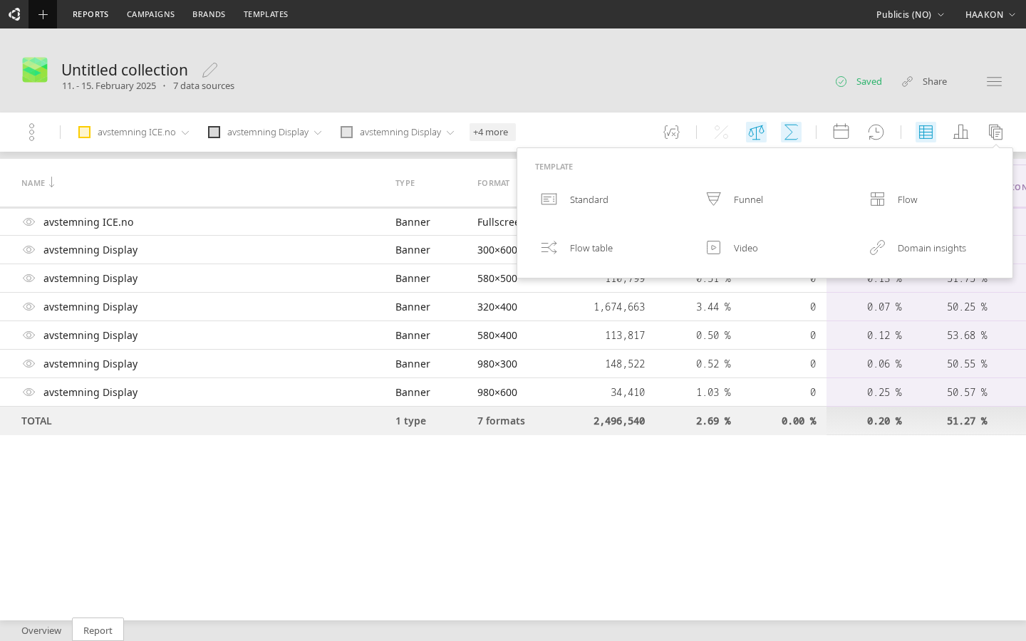
 opens a dialog for selecting a template.
Custom metrics
Clicking the icon shows dialog for typing in custom metric, with one example shown on the dialog's input line.
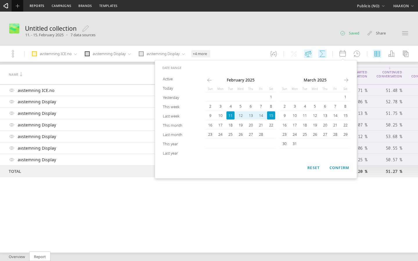
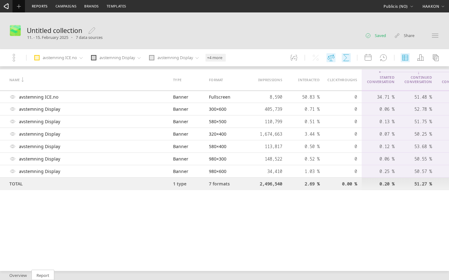
Table view
The  icon toggles between showing the data visualization and the underlying data in a sortable table.

In the table view, the conversational metrics are highlighted with color, separating the conversational metrics from industry-standard metrics.

The bottom line of table view shows the sum value for all rows.
NOTE - Table view always calculates all lines together regardless if some lines represent the same data. Thus you have to take care that for example if one line has values from a creative group, there won't be lines showing creatives under that same creative group - or manually substract the duplicate values from the sum.
Percentile change
The icon toggles between showing the actual values, and the percentile change between the values.
Rates
The icon toggles between showing the actual values and the rates of the values. For example, between showing Started and Started rate.
Data aggregation
The icon toggles between showing the actual values, and showing the aggregate values. For example, if a line graph is showing data for 30 days, with daily time buckets, then aggregating it would reduce 30 observations to a single observation. This can be useful when Table toggle is on.
Chart types
The icon opens a menu for selecting graph types.
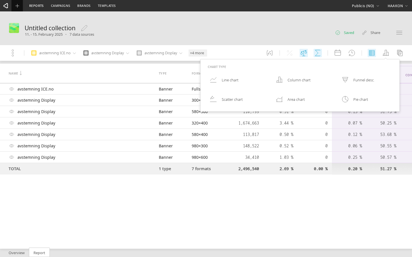
- Line chart
- Column chart
- Funnel chart
- Scatter chart
- Flow table — a component-level table view of the conversation flow. Breaks down each prompt, choice, and interaction node with detailed metrics. Includes tree structure, component type filtering, and sorting. See the dedicated Flow Table page for full documentation.
Date range
The icon opens date range selection. The first selection is the starting date, and the second selection is the end date for the time period to show.
On the left side of the date range dialog are shortcuts for selecting Today, Yesterday, This week, etc. On the top, choosing "Active" automatically selects the date range for active period of current data. You can use this preset to select time range since first to last activity (at least one impression).
Time buckets
The icon opens menu for time buckets. For example, if the data will be grouped in days, hours, and so on.
- Hourly
- Daily
- Weekly
- Monthly
Templates
opens a dialog for selecting a template.
Exporting data
Clicking the  icon and selecting "Export as..." option opens a dialog for exporting the underlying data or a graph. Both have several options.
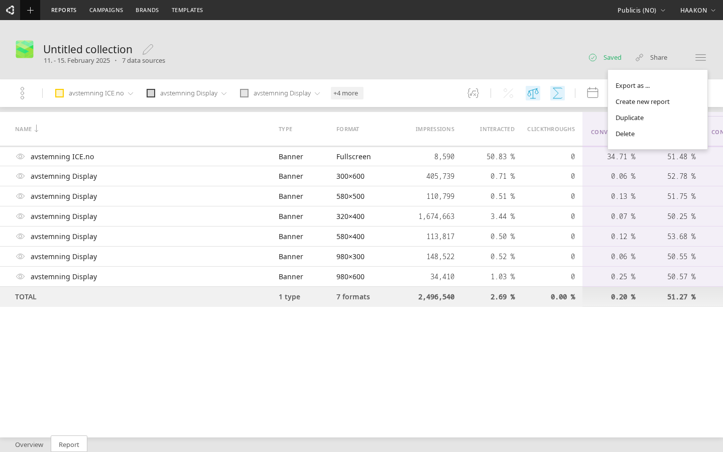
Data export
- CSV
- Excel
- JSON
Graph
- PNG
Managing reports
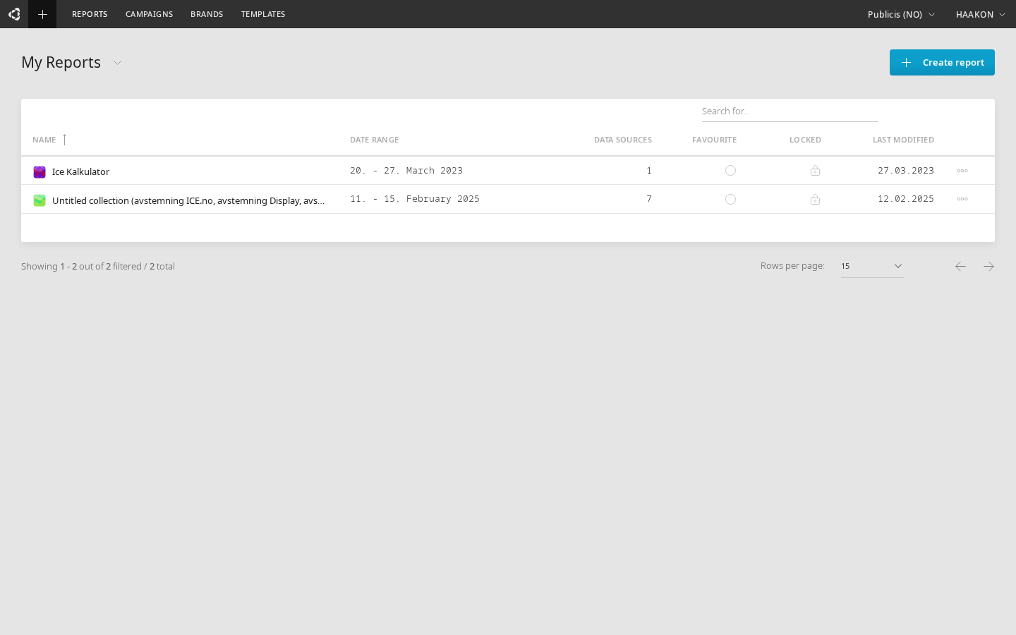
When you select "Reports" from the top main menu in Cavai Cloud, you will be able to select between seeing recent reports or shortcutted reports.
These two lists of reports are stored locally on your computer's browser.
Recent reports list
Recent reports list is automated: when a report is created or edited, it is automatically added to the list. This list is shown by default when you click "Reports" from the top menu.
Shortcutted reports list
Shortcutted reports list looks similar to the recent reports list, but shows the reports that you have manually added to the list by clicking "Add to shortcuts".

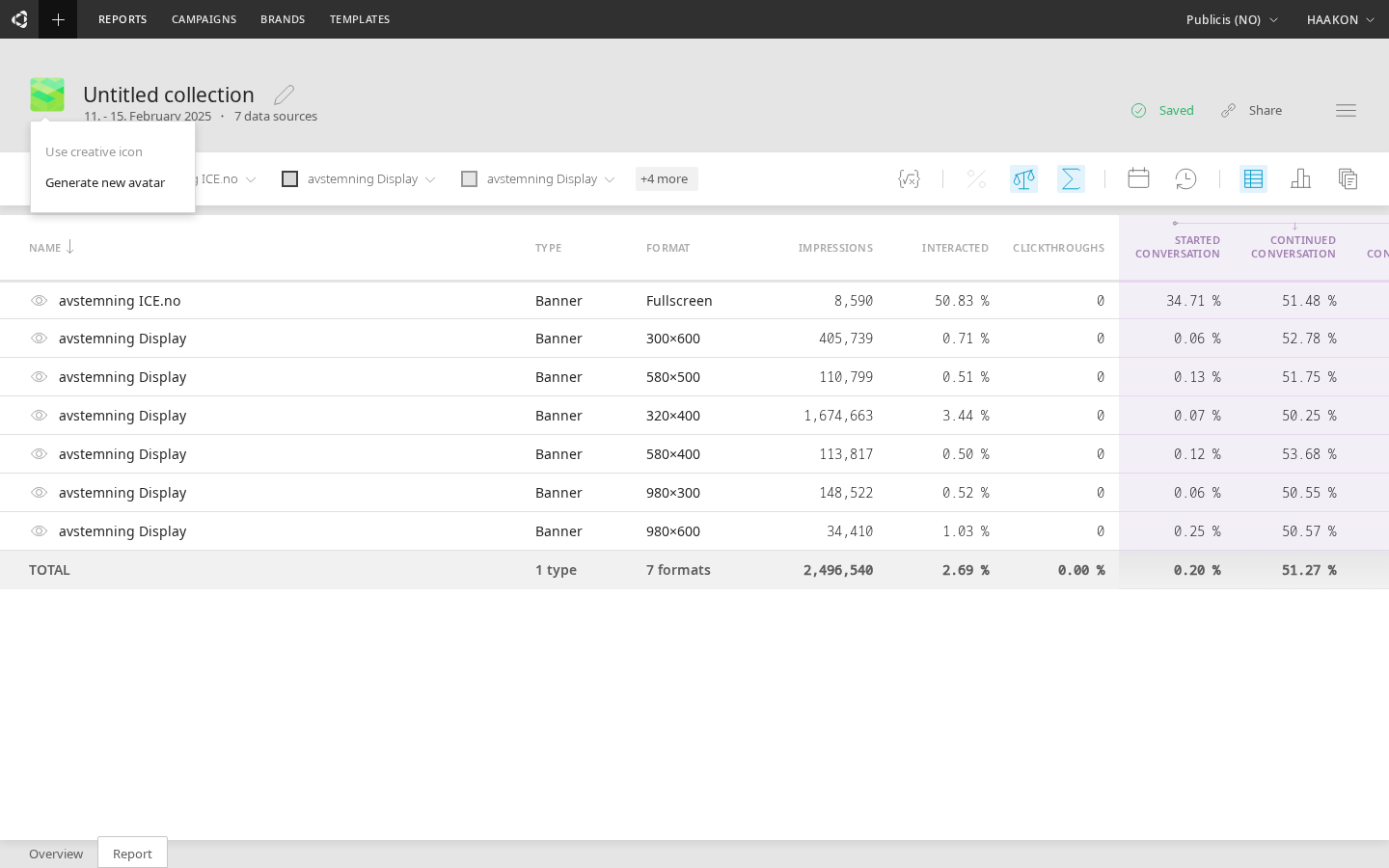
Using avatars to identify reports
After working with reports for a while, your reports lists might get pretty long. When this happens, it is really nice to be able to spot the needed report from the list immediately, with one glance. For this Cavai Cloud offer avatars - icons that are individual for each report.
When selecting data sources, if one creative is selected, the avatar for the report will be made according to the creative logo. If more than one data sources are selected, the avatar for the report will be custom randomized.
The report's avatar is different for each different data source selection until you name the report or select the avatar manually. After this, it doesn't anymore change unless you manually change it by clicking the avatar and selecting "Generate new avatar".
Sharing reports
Sharing a report is easily done by clicking "Copy URL" button and sending the URL using your preferred messaging application.
