Creative Flow
The Flow tab in the Builder is where you build the conversational interaction of a creative. It provides a canvas where components are added, connected, and configured to create the user experience — from simple display ads to complex multi-step conversations.
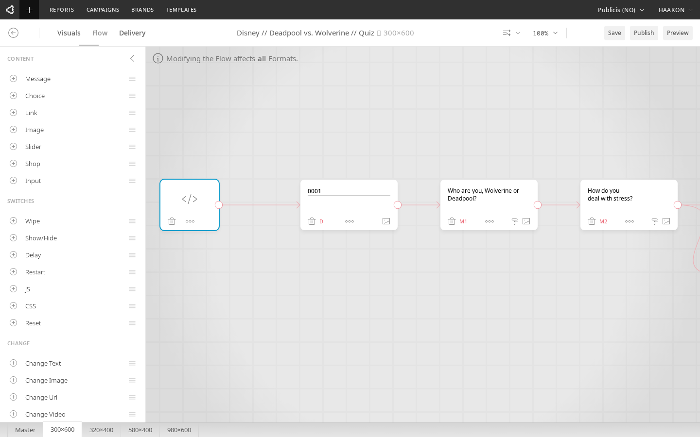
Creative canvas
The canvas represents the creative as a flow diagram. Components are placed on the canvas and connected to define the order and branching of the interaction. You can drag, reorder, and connect components to build the desired user journey.
Components
Components are the building blocks of a creative's interaction. They fall into three categories:
Basic components (visual)
These render visible content in the creative:
| Component | Description |
|---|---|
| Text | Displays a text message (prompt, statement, or any text content). Supports inline CSS and HTML. |
| Choice | A clickable response option presented to the user. Multiple choices create branching paths. |
| Image | Displays an image anywhere in the interaction. |
| Text Input | An open text input field for collecting user responses (email, name, etc.). Data is never stored in Cavai Cloud — see Text Inputs. |
Functional components (behavior)
These don't render visible elements — they trigger actions or modify behavior:
| Component | Description |
|---|---|
| CSS | Applies custom CSS styling at a specific point in the flow. |
| Delay | Pauses the flow for a specified duration before continuing. |
| Redirect | Redirects the user to a URL. |
| Script | Executes custom JavaScript (e.g. for tracking or third-party integrations). |
| Library Script | Selects and configures a pre-built script from the script library. Choose a script from the searchable dropdown, fill in its parameters (including text, color, toggle, dropdown, and video uploads), and the assembled script is inserted into the flow. Scripts are filtered to show only those compatible with the creative's current blocks and operators. |
| ShowHide | Shows or hides visual elements based on flow progression. |
| Reset | Resets the creative state. |
| Restart | Restarts the interaction from the beginning. |
| Payment | Triggers a payment flow (PayPal integration). |
Rich components
These are larger, self-contained interactive elements:
| Component | Description |
|---|---|
| Slider | A carousel of slides — either manually configured or loaded from a data feed. Each slide has text, a link, and an image. Can be used as the only component. |
| Video | Displays and plays video content. Supports autoplay, pause behavior, and streaming. Can be used as the only component. See Formats / Video. |
| Form | A complete form with multiple input fields (text, email, phone, dropdown, checkbox, radio, date, number, range). Includes submit button and consent handling. |
| Shop | Product shopping component for e-commerce integrations. |
How the flow works
Levels
A level is a segment of the interaction. Each level typically starts with a prompt (Text component) and ends when the user makes a choice or the flow automatically progresses.
Level 1: Text → Choice A / Choice B
Level 2a: Text (after A) → Choice C / Choice D
Level 2b: Text (after B) → ...
When there are no more components to display, the interaction has reached its end.
Progression
The flow progresses in different ways depending on the component types:
- Choice components require user input — the flow pauses until the user clicks one
- Text components that aren't followed by choices auto-progress after the typing animation
- Functional components (Delay, CSS, Script, etc.) execute and continue automatically
- Rich components (Video, Slider, Form) can fill the creative container and operate independently
Typing animation
Text-based components support typing animation to create a conversational feel. The animation style (type-in, fade-in, or none) and speed are configurable in the Visuals tab.
Component options
Each component on the canvas has options accessible from its context menu:
| Option | Description |
|---|---|
| Set as First | Mark this component as the first in the interaction |
| Set as Goal | Mark as a goal component (tracked as a goal_met metric) |
| Tracking | Add a custom tracking event (e.g. fire a pixel in Adobe, DV360, etc.) — see Custom Events |
| Background image | Set a background image that appears when this component is displayed, with optional click-through URL |
| Emoji | Add emoji characters to text content |
| Delete | Remove the component from the flow |
Custom events
For tracking custom events, you need a tracking tag from your ad platform (Adobe, DV360, etc.). Events can be set up per component from the options menu, or by using a Script component in the flow for more control.
CSS support
Text and Choice components support inline CSS. Add CSS directly in the component's text area, separated from the main content. This allows fine-grained styling of individual components beyond what the Visuals tab provides.
Node branding
The flow canvas supports visual organization features that help you label and color-code nodes for easier navigation in complex flows.
Node labels
Click any node on the canvas to add a text label (up to 200 characters). The label is displayed above the node and is useful for annotating the purpose of a component — for example, marking a choice as "Quiz Q1" or a text node as "Welcome message".
Node colors
Assign a color to any node from a palette of 8 colors. Hover over a node to reveal the color toolbar, then click a swatch to apply it. Colors are purely visual — they don't affect creative behavior.
Color filter panel
A color filter panel in the top-right corner of the canvas lets you filter nodes by color. Click a color swatch in the panel to dim all nodes that don't match, making it easy to focus on a specific group of components in a large flow.
Flow-triggered animations
Flow components can trigger CSS animations on visual blocks when the flow reaches them. An animation trigger icon appears on the toolbar of compatible flow nodes (Text, Choice, Image, Text Input, and Change operators).
Configuring a flow animation
Click the animation trigger icon on a flow node to open the animation panel. The panel lets you configure:
| Setting | Description |
|---|---|
| Trigger | When the animation fires: On appear (when the flow reaches this node), On click, or On hover |
| Target block | Which visual block to animate. Choose "Self" to animate the node's own block, or select any other visual block in the creative |
| Effects | The animation effects to apply (same presets and effect types as block animations) |
| Duration | Animation length in milliseconds |
| Easing | The acceleration curve |
Multiple targets
A single flow node can animate multiple blocks at once. Click Add target to add another target block, each with its own effects, duration, and easing. Targets are shown as collapsible cards in the panel.
Change operator animations
Change operators (Change Image, Change Text, Change URL, Change Video) have a simplified animation panel with transition-style presets (Fade, Slide, Scale, Blur, Pop, Wiggle, Bounce, Zoom, Flip). These animate the transition between the old and new content.
Change operator previews
The Change Image and Change Video operators display a side-by-side before/after preview within the flow node. The left slot shows the current content of the target block (dimmed), and the right slot shows the uploaded replacement. An arrow between them indicates the direction of the change.
- If no target is selected or no content exists yet, an empty placeholder with a dashed border is shown
- Press and hold on either thumbnail to enlarge it for a closer look
- If multiple Change operators target the same block in sequence, each operator shows the output of the previous change as its "before" state, reflecting the cumulative effect through the flow
ShowHide animations
ShowHide operators support animation presets per target. When showing or hiding a block, you can select an animation preset, duration, and easing to animate the visibility change instead of an instant show/hide.