Creative Settings (Visuals tab)
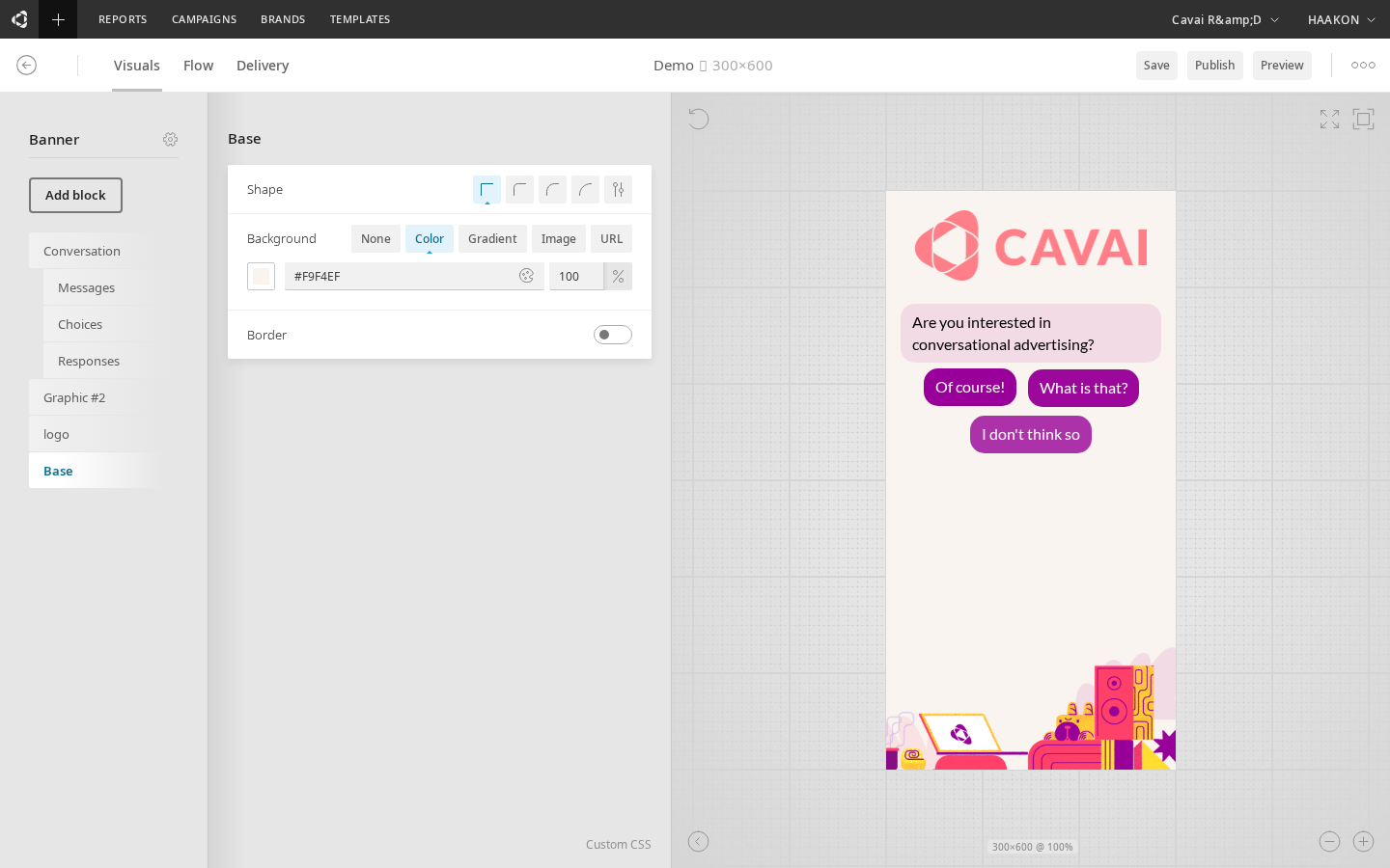
The Visuals tab in the Builder controls the visual appearance of the creative — colors, fonts, dimensions, backgrounds, borders, and layout. The left panel shows configurable blocks, and the right panel shows a live preview of the creative as last saved.
WARNING
The preview reflects the last saved state. You must save the creative before changes appear in the preview.
Visual blocks
The creative is composed of visual blocks, each configurable independently. The available blocks depend on the creative type (Banner or Expandable).
Container blocks
Base
The background container of the creative's expanded view.
| Setting | Description |
|---|---|
| Background | Solid color, gradient, or image |
| Border | Enable/disable, width, style, color |
| Border radius | Corner rounding |
| Custom CSS | Raw CSS overrides |
Conversation
The main message/chat area where the conversational flow plays out.
| Setting | Description |
|---|---|
| Speed | Conversational, swift, instant, or custom (seconds) |
| Typing animation | None, type-in, or fade-in |
| Scroll behavior | Cut-off or fade-out |
| Background | Color, gradient, or image |
| Border & box shadow | Styling options |
| Size & positioning | Width, height, alignment |
| Custom CSS | Raw CSS overrides |
The conversation block contains sub-blocks for styling the individual message types:
- Message — bot/prompt message bubble styling
- Choice — answer/response button styling (fit mode: efficient or single)
- Response — user response/selected choice styling
Expandable Initial (Expandable type only)
The collapsed state of an expandable creative (bubble, avatar, or floor element) before the user interacts.
| Setting | Description |
|---|---|
| Alignment | Left, center, or right |
| Tagline above icon | Toggle tagline display |
| Margin | Spacing around the element |
Contains sub-blocks:
- Icon — the avatar/icon image and size
- Tagline — text label with optional speech bubble tail
- Remove — close/dismiss button
Expandable Expanded (Expandable type only)
The expanded state container, controlling max dimensions and alignment.
Visual element blocks
These blocks represent individual visual components placed in the creative:
Text
Displays text content with configurable font family, size, weight, color, and alignment. Available fonts include Arial, Lato, Montserrat, Open Sans, Roboto, Ubuntu, Inter, Poppins, Nunito, Oswald, and Raleway.
Graphic
Displays an image with configurable size, border, alignment, and positioning.
Button
A clickable button with configurable text, font styling, background, border, and padding.
Buttons support templates — preset style configurations that you can apply as a starting point. Available templates: Minimal, Basic, Outline, Elevated, Glass, and Push. A revert button appears on the template button when you have modified the style from the template defaults. Switching templates on a modified block shows a confirmation dialog.
Buttons also support state styling — configurable hover and active (pressed) states with transition timing. Each state can override background, border, box shadow, text color, opacity, filter, backdrop filter, and transform (scale, rotate, translate). Use the state selector tabs (Default / Hover / Active) to preview and configure each state.
HTML
A custom HTML/code block. Includes template presets: Default, Empty, CSS Only, and Responsive.
Video
Video playback block with options for autoplay, pause behavior (pause after N seconds, pause when out of view), streaming, and layout mode (scale, preserve, stretch).
Slider
Carousel/product slider block with two modes:
- Feed mode — loads products from a data feed URL with optional filtering and sorting
- Manual mode — manually configured slides
Options include arrow controls, edge fade, slide width, and tease animation (delay, duration, iterations).
Header
The header/title area of the creative, including header text and branding.
Label
Text labels (e.g. "ad" label for ad disclosure).
Close
Close/dismiss button with configurable alignment.
Form blocks
Form
A form container for collecting user input (email, phone, text, etc.).
Form Input
Individual input fields within a form. Supported types:
| Type | Description |
|---|---|
| Text | Single-line text input |
| Text Area | Multi-line text input |
| Email address input | |
| Phone | Phone number input |
| Number | Numeric input |
| Date | Date picker |
| Dropdown | Select from a list |
| Radio | Radio button selection |
| Checkbox | Checkbox toggle |
| Range | Slider/range input |
| Clickout Link | A link that opens in a new tab |
Each input has settings for placeholder text, label, required/optional, and visual styling.
Form Submit Button
The submit button for the form, with configurable text and styling. Supports state styling for hover, focus, active, disabled, loading, success, and error states with transition timing.
Block animations
Most visual element blocks — Text, Graphic, Button, HTML, Video, and Form — include an Animations tab alongside the Design tab. Switch between them using the tab bar at the top of the block configuration panel. (Slider does not support animations.)
The Animations tab lets you configure CSS animations that play when the block appears, is hovered, or is clicked. Button blocks only support the Appear trigger, since hover and click already have dedicated state styling.
Effects
An animation is built from one or more effects. Each effect animates a single CSS property:
| Effect | Description |
|---|---|
| Opacity | Fades the block in or out |
| Slide X | Slides horizontally |
| Slide Y | Slides vertically |
| Scale | Grows or shrinks the block |
| Rotate | Rotates the block |
| Blur | Applies or removes a blur |
| Skew | Skews the block |
Each effect has keyframes — start and end values that define the animation range. Click Add effect to add an effect, and Add keyframe to add intermediate keyframe points within an effect.
Presets
Click Preset to apply a pre-built animation configuration. Presets include Fade In, Fade Out, Slide Up, Slide Down, Bounce, Pop, Pulse, Shake, Rotate, Flip, Zoom In, Zoom Out, Elastic, and many more. Applying a preset replaces any existing effects — a confirmation prompt is shown if you have made manual changes.
Animation settings
| Setting | Description |
|---|---|
| Trigger | When the animation plays: Appear (on load), On Hover, or On Click |
| Duration | Animation length in milliseconds (50–5000 ms) |
| Delay | Time to wait before the animation starts (0–5000 ms) |
| Easing | The acceleration curve. Choose from standard presets (Ease, Linear, Ease In, Ease Out, Ease In-Out) or define a custom cubic-bezier curve using the visual bezier editor |
| Loop | Whether the animation repeats continuously |
| Repeat Count | Number of times the animation plays (when Loop is off) |
| Direction | Normal, Reverse, Alternate, or Alternate Reverse |
Preview
When effects are configured, a live preview box appears at the top of the Animations tab showing how the animation will look. Click the replay button to re-run the preview.
Copy and paste
Use the copy and paste buttons in the Animation card header to copy an animation configuration from one block and paste it onto another. This lets you quickly apply the same animation across multiple blocks.
Common settings
Most visual blocks share these configurable properties:
| Category | Settings |
|---|---|
| Background | Solid color, gradient, or image |
| Border | Width, style, color, radius |
| Box shadow | Offset, blur, spread, color, inset |
| Filter | CSS filter effects (blur, brightness, contrast, grayscale, saturate, hue-rotate, invert, sepia) — available on buttons |
| Backdrop filter | Same filter effects applied to the area behind the element — available on buttons |
| Size | Width and height (linked or independent) |
| Margin & padding | Per-side spacing |
| Position | Absolute positioning (top, right, bottom, left) |
| Alignment | Horizontal (left, center, right) and vertical (top, center, bottom) |
| Rotation | Rotation angle in degrees |
| Custom CSS | Raw CSS for advanced customization |
Multi-format overrides
When working with multi-format creatives, child formats inherit settings from the parent creative. Individual settings can be overridden per child format — overridden settings show a visual indicator in the Visuals tab. This lets you maintain a single source of truth while adjusting sizing or layout per format.